

Creating an identity for our company was an interesting exercise. We had a clear vision of what
Verinite represents and wanted to communicate that effectively through our visual identity.
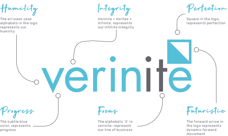
Our logo
We seek to attain perfection in everything that we undertake and so we used a ‘perfect square’ as the base of our symbol. The perfect square also represents “The Window of Opportunity”. We created a ‘v’ and ‘n’ inside the symbol because the word ‘Verinite’ is composed of two parts, ‘Veritas’ (which means integrity in Latin) and ‘Infinite’.
Our colors
The vibrant blue reflects our positive energy and our modern outlook. It is also the colour of the sky, because Verinite is a place that offers unlimited opportunities. The vibrancy of the blue has been softened by a more solemn grey, which reflects our extensive experience
in this industry.
Our identity
The logo stands as an inspiration for us to adopt a progressive mindset at work, constantly working towards perfection and staying closely aligned to our core values as we progress.
